The graphs below are a few simple visualisations using the Matplotlib library with the aim of showing how electricity generation in the United Kingdom has evolved in the last decade or so. Data were taken from official government statistics used in the annually published “Digest of UK Energy Statistics” reports [1]. This is my first Matplotlib project in which I am getting familiar with it and exploring its capabilities. I’ve referred to the official examples in the documentation while learning Matplotlib [2]. The Python code for these is available in my GitHub repository.
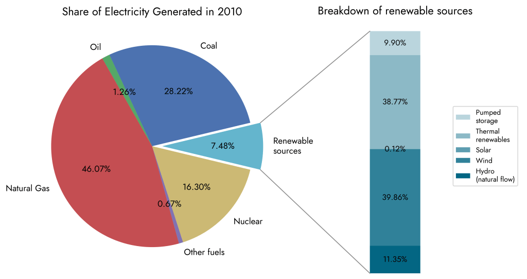
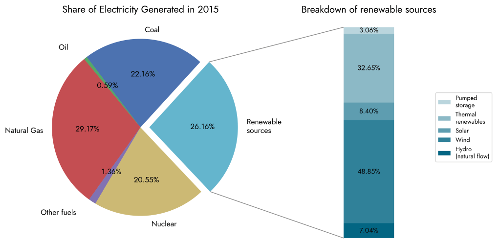
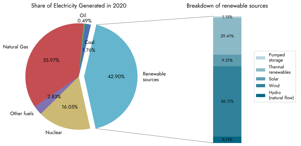
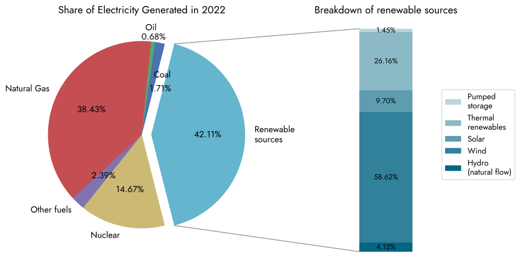
Figure 1 – A sequence of four pie charts to show the proportion of major energy sources in the UK and how they evolved over the years. There’s a breakdown of the renewables category for each year. Click on any of the charts to enlarge them. Data source: Table 5.6.C in [1].

Figure 2 – Evolution of different renewable sources. Note the rapid growth of onshore and offshore wind power as a result of the capitalisation on favourable conditions for wind energy in the UK. In contrast, photovoltaics has unsurprisingly reached a plateau even with government incentive schemes such as Feed-In Tarriffs. Data source: Table 5.6.B in [1].
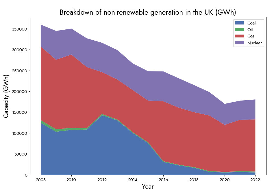
Figure 3 – Stacked line chart to show the overall decline in non-renewables and the decline of the constituent sources as a fraction of the total capacity. Data source: Table 5.6.B in [1].
References
[1] “Digest of UK Energy Statistics (DUKES): Electricity,” GOV.UK, 27-Jul-2023. [Online]. Available: https://www.gov.uk/government/statistics/electricity-chapter-5-digest-of-united-kingdom-energy-statistics-dukes. [Accessed: 06-Jun-2024]
[2] “Matplotlib Documentation – Examples page,” Examples – Matplotlib 3.9.0 documentation. [Online]. Available: https://matplotlib.org/stable/gallery/index.html. [Accessed: 06-Jun-2024]

G
LikeLike
Well presented. The pie charts give a useful quick overview.
LikeLike