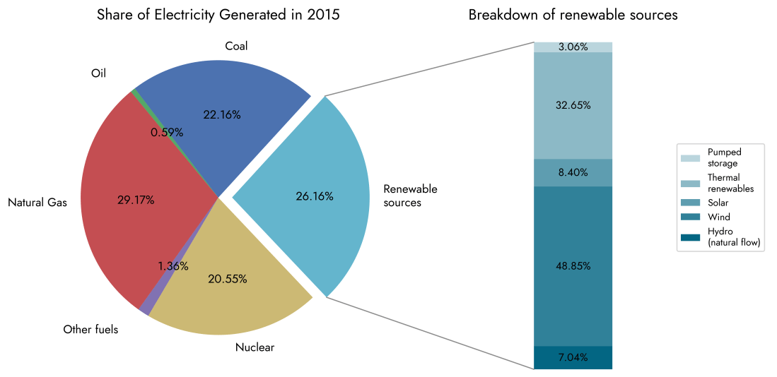
The graphs below are a few simple visualisations using the Matplotlib library with the aim of showing how electricity generation in the United Kingdom has evolved in the last decade or so. Data were taken from official government statistics used in the annually published "Digest of UK Energy Statistics" reports [1]. This is my first … Continue reading Visualising Energy Data with the Matplotlib Python library
Visualising Energy Data with the Matplotlib Python library