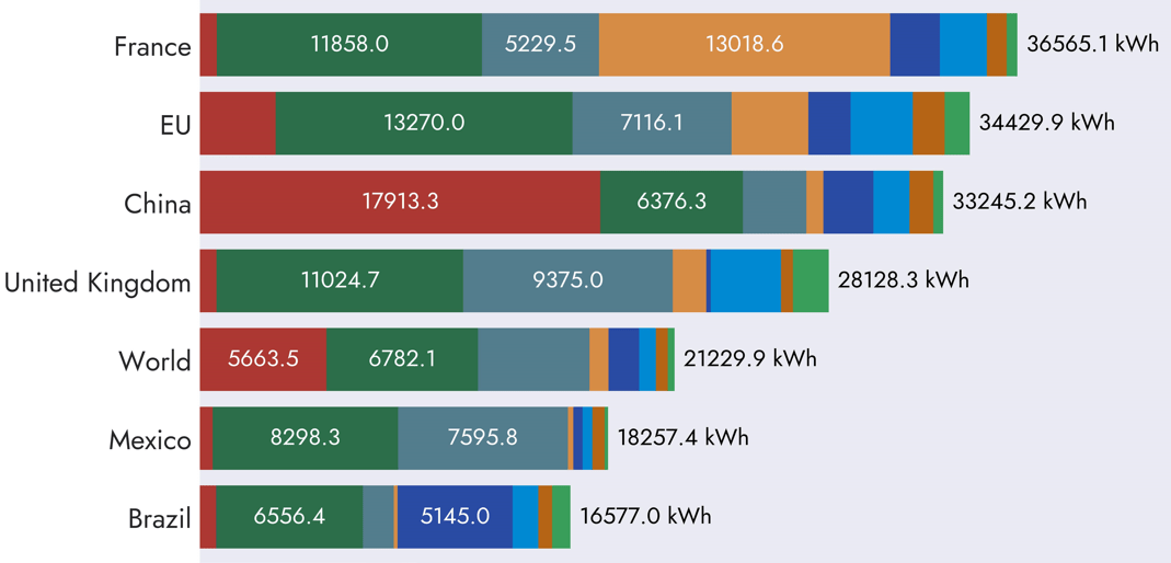
My goal with this project was to build an animation of a horizontal stacked bar chart using Python. The inspiration and the data used for this came from the charts on the ourworldindata.org website [1]. I set a challenge for myself to see if I could build the same type of chart that is able … Continue reading Animated Stacked Bar Charts with Python and Matplotlib
Tag: data visualisation
Visualising Energy Data with the Matplotlib Python library
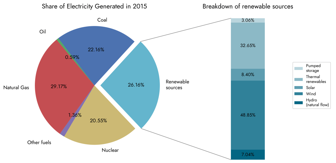
The graphs below are a few simple visualisations using the Matplotlib library with the aim of showing how electricity generation in the United Kingdom has evolved in the last decade or so. Data were taken from official government statistics used in the annually published "Digest of UK Energy Statistics" reports [1]. This is my first … Continue reading Visualising Energy Data with the Matplotlib Python library

