Sankey Diagrams in Python for Energy Commodities Flows

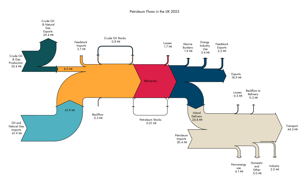
A Sankey diagram is a visual representation of the categories and flow of quantities from one set of starting values to another set of end values. These diagrams are named after the Irish engineer Matthew Sankey who introduced the first such energy flow diagram in an 1898 article on the efficiency of steam engines [1]. … Continue reading Sankey Diagrams in Python for Energy Commodities Flows

Euro 2024 Tournament Data Visualised with Python

Even though it feels like football's never coming home, I still enjoy the buzz and excitement of an international tournament every couple of years. Sports statistics is another avenue for data visualisation I've been curious about recently so I thought it's worth delving into each team's performance stats using Python and Matplotlib. The code for … Continue reading Euro 2024 Tournament Data Visualised with Python