Animated Stacked Bar Charts with Python and Matplotlib

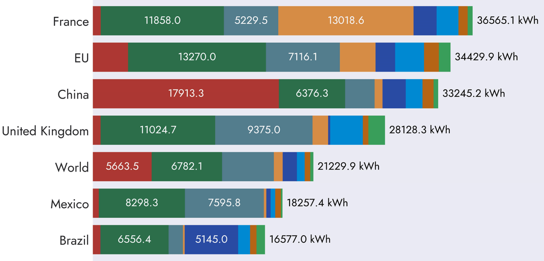
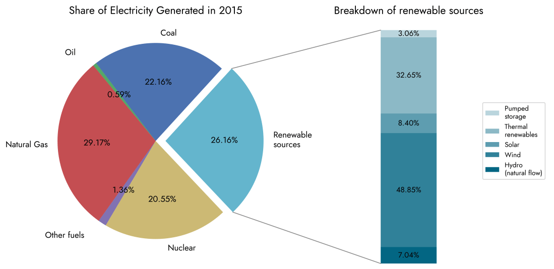
My goal with this project was to build an animation of a horizontal stacked bar chart using Python. The inspiration and the data used for this came from the charts on the ourworldindata.org website [1]. I set a challenge for myself to see if I could build the same type of chart that is able … Continue reading Animated Stacked Bar Charts with Python and Matplotlib

Sankey Diagrams in Python for Energy Commodities Flows

A Sankey diagram is a visual representation of the categories and flow of quantities from one set of starting values to another set of end values. These diagrams are named after the Irish engineer Matthew Sankey who introduced the first such energy flow diagram in an 1898 article on the efficiency of steam engines [1]. … Continue reading Sankey Diagrams in Python for Energy Commodities Flows

Simulating Digital Modulation Schemes and Constellation Diagrams

This Python project aims to visualise several digital modulation schemes used in communication systems through waveforms and Constellation Diagrams. Modulation is the process of encoding binary information bits into a carrier waveform by varying certain characteristics of the wave. The carrier amplitude, frequency or phase shift can all be varied either separately on their own … Continue reading Simulating Digital Modulation Schemes and Constellation Diagrams

Euro 2024 Tournament Data Visualised with Python

Even though it feels like football's never coming home, I still enjoy the buzz and excitement of an international tournament every couple of years. Sports statistics is another avenue for data visualisation I've been curious about recently so I thought it's worth delving into each team's performance stats using Python and Matplotlib. The code for … Continue reading Euro 2024 Tournament Data Visualised with Python

Visualising Energy Data with the Matplotlib Python library

The graphs below are a few simple visualisations using the Matplotlib library with the aim of showing how electricity generation in the United Kingdom has evolved in the last decade or so. Data were taken from official government statistics used in the annually published "Digest of UK Energy Statistics" reports [1]. This is my first … Continue reading Visualising Energy Data with the Matplotlib Python library

Visualising the Fourier series with the p5 JavaScript library

P5.js is an interesting JavaScript open-source library developed for programming dynamic graphical web applications. It offers a great deal of functionality for creating simulations or animations in the browser and is very similar to the processing.js library. The goal of this project is to build a new expanded version of the Fourier series simulation created … Continue reading Visualising the Fourier series with the p5 JavaScript library